When my friend proceeded to go through his method of handling enquiries from new photographers, he mentioned that he starts off the discussion with cameras, and how to use those cameras. After covering all of that, he will talk about the art of composition; evidently saving the best for last since he stated that composition is his favourite aspect of photography.
Composition also happens to be my favourite aspect of photography. And I love talking about it. Our mutual love of composition is ironic; because while the two of us talk about photography quite often, our discussions sometimes focus on cameras. We talk about which camera is better, because this one has more megapixels while this other one has a faster burst mode. We talk about image quality; about the chromatic aberrations found in various lenses, and the destructive nature of processing RAW files with outdated versions of Photoshop or Lightroom. We talk about work flow and digital asset management and calibrating monitors and how to make sure the colours will come out just so during printing. In other words, we talk about everything except composition.
What is the purpose of the preceding three paragraphs? So that I could rag on my friend. And to thank him for allowing me to start off this entry with something other than:
"Next, composition."
Composition is the single most important aspect of a good photograph.
In the visual arts, composition is about ensuring that the elements of a work are at their most pleasing to the eye. In photos and paintings, composition boils down to making sure that everything is placed just so. A badly composed photo might still draw massive raves based on the subject -- watching people coo and caw over any photo with a cute baby, or a few cute animals, is proof enough of that -- but if a cute subject is enough to raise a photo to the level of "good", making sure that that photo is well composed will raise it to the level of "more good".

Les Yeux d'Or (or A More Good Photo of a Cat)
With the advent of digital photography, Photoshop, and the absolute mass of information available on the Web; every budding photographer has a an excess of techniques with which to help them make an photo pop. It is a large and incredibly helpful bag of tricks. But it has to start with a well-composed base. All the HDR, selective colouring, tilt-shift and Orton Effect in the world isn't going to save a badly composed image.
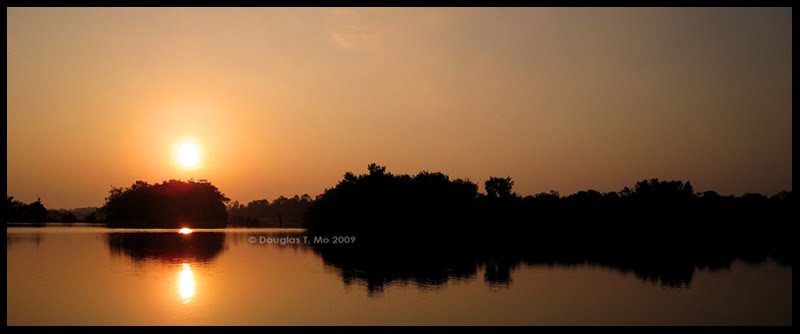
Only very rarely is a photographer going to get a subject so iconic, with a vantage point so classic, that the composition is next to impossible to screw up.

Morning Illumination, taken at sunrise at Machu Picchu
All discussions about art composition start with the Rule of Thirds. This makes since since it really is the easiest rule to understand and to visualise. The grids available on the LCD or viewfinders of many point-and-shoot digital cameras are there to help the user to follow the Rule of Thirds. For the sake of brevity, I won't go into the details. If your eyes haven't already glazed over, and you wish to learn more; either the link I've provided, or a Google search, will start you on your journey.
Arts programs will proceed to examine the Golden Ratio; but while the concepts make for interesting study, they are much less useful when trying to frame of photograph in the field. I understand the theory behind the sectioning of rectangles, but if you can figure out a way to quickly apply this while taking a photo, please let me know.
When talking about composition, other keywords and concepts include: framing, balance, symmetry and asymmetry, colours and contrast, simplicity, lines, and leading the eye.
But the rules only get you so far. A famous American general, and namesake, once said, "Rules are mostly made to be broken and are too often for the lazy to hide behind." While taking good pictures is nothing like winning wars in the Pacific Theatre, I think the same general philosophy applies. Trying to produce good photography isn't about adhering to rules; it isn't about running through a readily available set of algorithms. I know. I've tried that tack.
I started off by following the rules. Once I made as much progress as I could doing that, I went about breaking those rules; constantly, deliberately and ecstatically.
There is a lot of technical criticism that can be levelled against the following image. It is muddled. The reflections on the glass add a distracting level of disorder right across the face of the subject. Elements of the background merge shockingly with the foreground, and the use of black and white exacerbates this by allowing distinct objects to bleed together. This image was very nearly culled during the first round of edits I made on that day's captures. But eventually something clicked for me, and this photograph made it into my artistic portfolio.
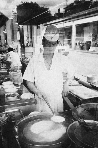
Into the Kitchen, taken in Toronto, Canada
Sometimes, you can't rebel for trying.
Using the Rule of Thirds in landscape photography dictates that the horizon should be placed on one of horizontal dissecting lines. I was pretty pleased with myself for producing what I thought was an unconventional image:

East Cape Pohutukawa, taken near Tatapouri, New Zealand
I was further gratified when people told me they liked the photo because of its "unique composition". I was ready to have "Rule-Breaking, Rebel of an Ass-Kicking Photographer" printed up on a t-shirt. Then I looked at the picture again; and realised that while the positioning of the horizon is a little out there, the delineation between the pohutukawa tree and the sky falls almost exactly falls on the leftmost vertical line in the Rule of Thirds' grid.
I also discovered, a few years ago, that all of my more powerful images -- even when I thought I'd thrown the rules out of the window -- inadvertently adhered to the Diagonal Method.

Voyeur #91, taken at the 2007 Toronto Nuit Blanche.
Eventually, I stopped paying so much attention to rules; whether in the following or in the breaking; and just started trying my best to take photos I think look good. I want to make the best images I can make, which I think is all anybody can ask of anybody out taking pictures.
If you want to learn more, Bryan Peterson's Understanding Exposure is the first book I point to. It goes into composition, but also does a great job of explaining the technical side of photography; of how to get blurry backgrounds, or freezing motion, or a shot of a grand vista where everything is in focus. It is a fantastic book, not only for beginners, but also for more experienced photographers who want to brush up on the fundamentals.
Related Entries:
1. Lessons From a Photographic Snob (Part I)
0 comments
Post a Comment